Branding as UX: ACME Technologies
ACME is a SaaS platform providing unified event planning and resource management services, including B2C online ticket sales and B2B business administration services for venues such as museums, theaters, cruise lines, and the like. “ACME” was never intended to be the company name—a “real” name was supposed to be chosen when the company moved out of stealth mode. As a result, the company’s first logo looked like this:
[this space intentionally left blank]
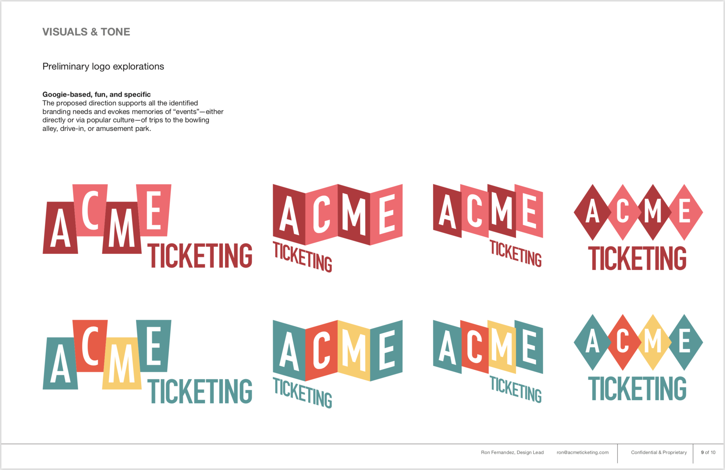
But there was a problem. The CEO was planning to go to New York to pitch to the Museum of Modern Art (MoMA), the New Museum, and the Jewish Museum but we had not yet chosen a “real” name. We still needed, at minimum, to look like a real company and have a logo that would look on business cards (t-shirts were less of a priority as they are frowned on for New York business trips). I designed this:
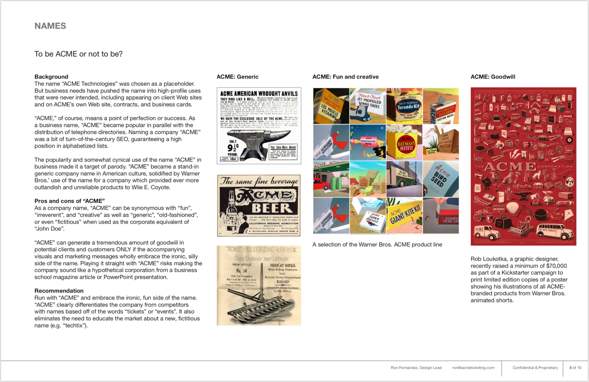
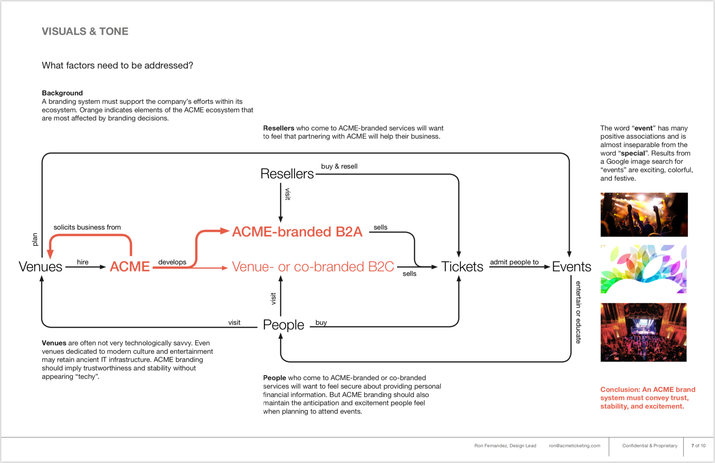
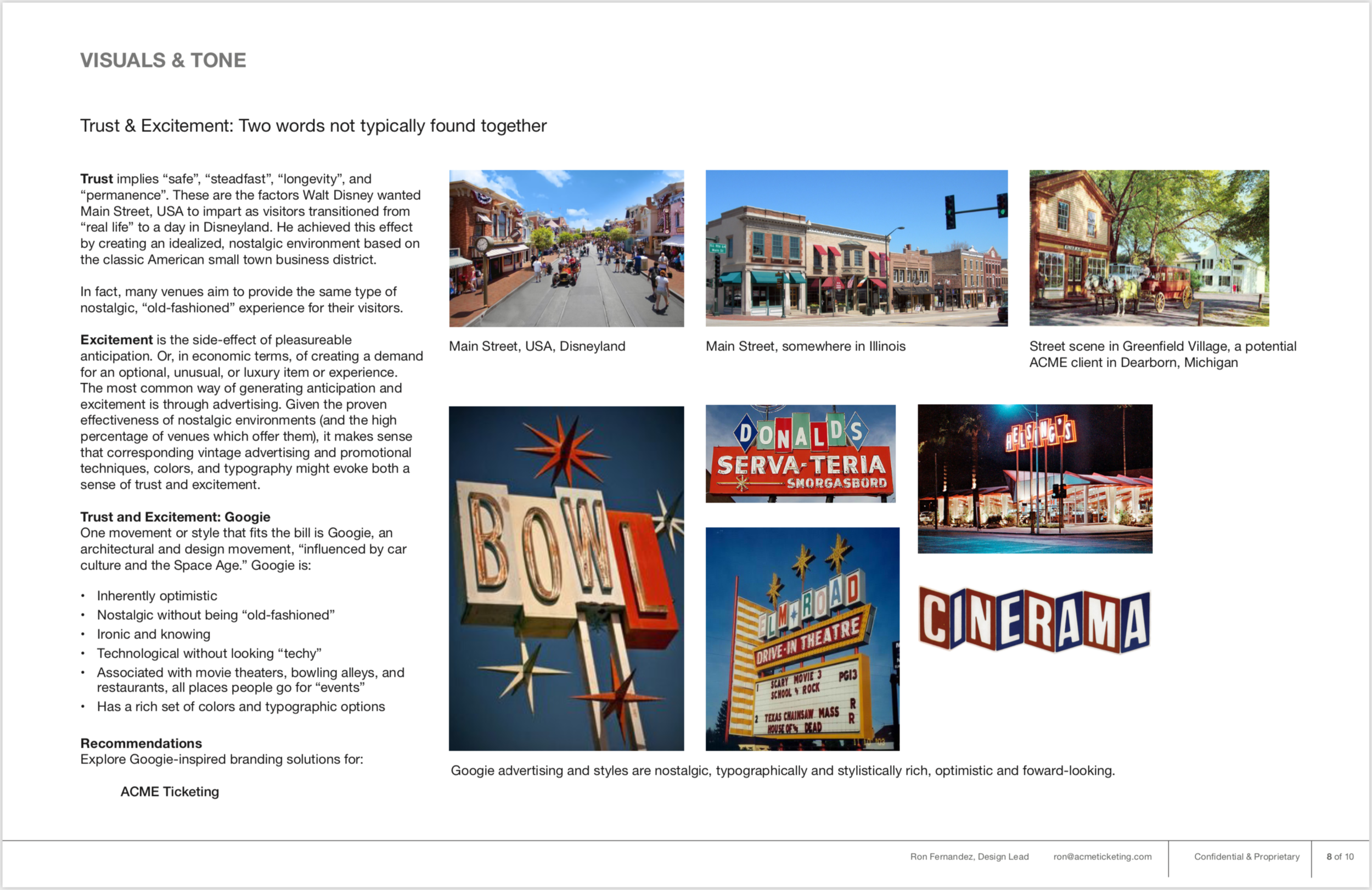
I put together a design brief to sell the logo to the team:
Using that design language, I was able to design a white-label point-of-sale application which represented what we thought ACME was all about:

ACME white-label point-of-sale app for iOS.