Systems design | Product design
I have spec’ed, designed, and launched many products in my career, ranging from consumer products such Palm handhelds and Amazon Kindle e-readers to business administration systems for unified communication, customer support, and dynamic pricing.
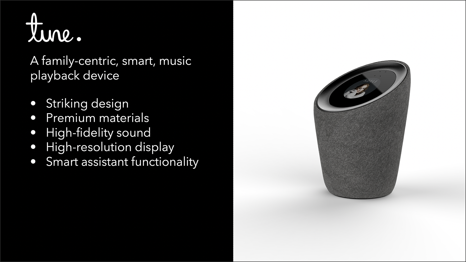
Samsung smart speaker
Voice, touch, and hardware integration
I was a senior design director at ID8, Samsung’s in-house Internet of Things (IoT) innovation team. I designed “tune”, a prototype smart speaker which incorporated a mechanical navigation wheel (akin to the original iPod ID), on-screen touch interface, and voice interactions. “tune” was demoed at CES 2017 as part of the Samsung ARTIK IoT presence.

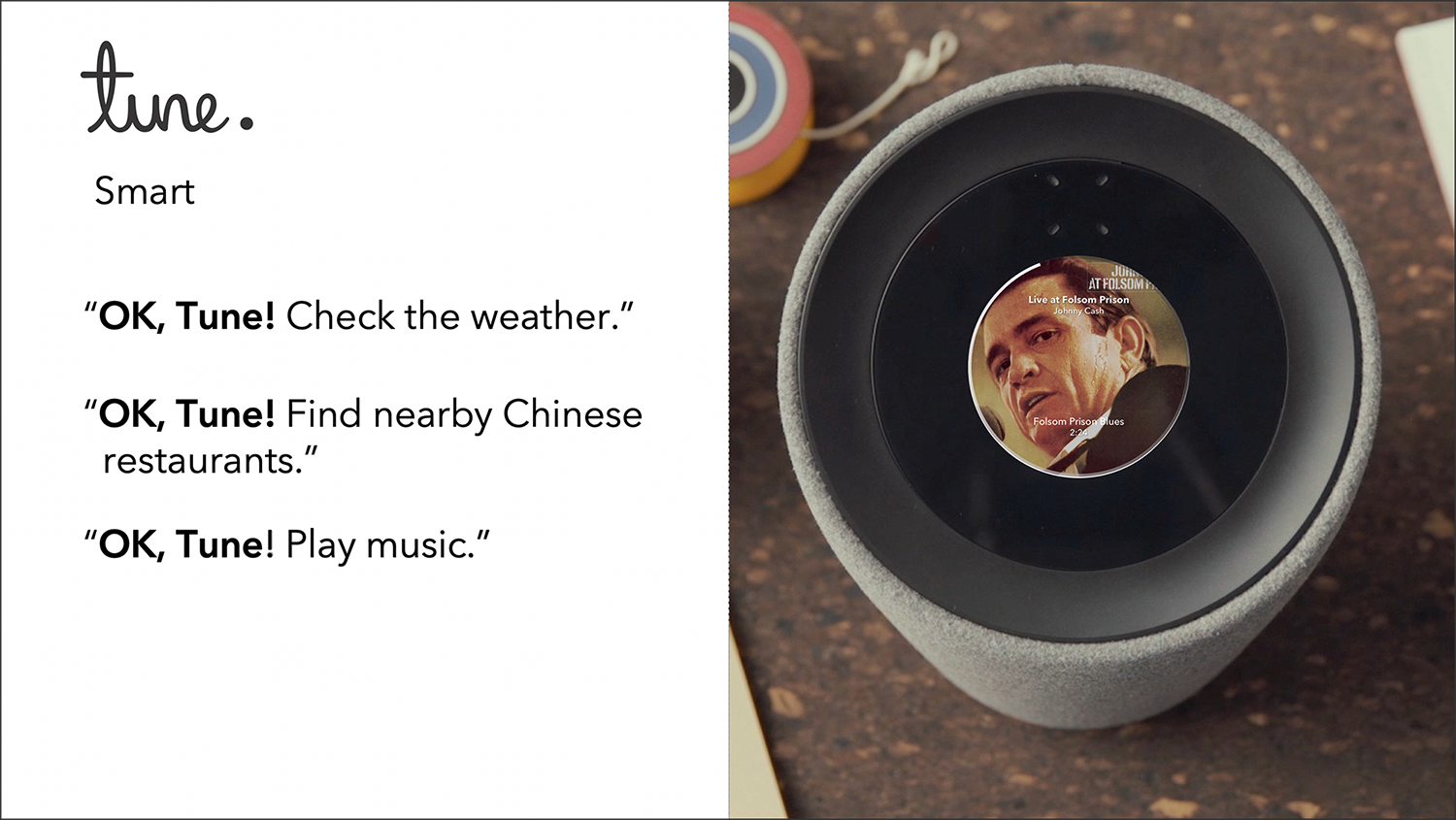
Voice interaction design
Hands-free voice interaction was critical to the tune interaction model. Given tune was positioned as a high-quality entertainment device I emphasized as many different ways a user could request music as possible when designing the voice syntax spec.
It’s interesting to note how a detailed voice syntax spec is not dissimilar to a narrow AI training model. VIEW FULL SPEC▸
Touch and hardware interaction design
Touch and mechanical controls provided additional context and options when integrated with a voice-driven UX. The final interaction spec had to incorporate any combination of voice, touch, and hardware interactions.
VIEW FULL SPEC▸
Eversense glucose pump app
Medical devices, FDA approval
Designing the FDA-approved mobile app for Eversense’s first permanently-implanted glucose sensor required understanding the underlying science and issues faced by diabetes patients. The mobile app status displays had to make sense to people who had little technical or scientific background while also providing sufficiently-detailed data for people interested in tracking their health more closely.
Before and after
Main screen
Display current blood sugar reading, trend (going up/down and how fast), and a timeline of activities (blood sampled, exercise, meal times, etc.). Standard status colors provided additional context but were not the only indication of state.
The blood sugar graph was surprisingly complicated to design. The client wanted the scale to range from 40 mg/dl to 400 mg/dl. A linear scale would have looked very bottom-heavy as most blood sugar data would be displayed in the bottom 50% of the graph. I solved the problem by using a logarithmic scale. The target range was vertically centered on the scale and the upper and lower ranges were approximately the same size.
Linear vs. logarithmic scale?
System status
A working configuration includes the implanted sensor, the transmitter attached to the skin over the transmitter, the app, and the glucose pump.
ACME
Administration portal, white label Web site, iOS apps
I was the product manager and designer for the ACME product suite which consists of a B2B administrative backend, white-label consumer B2C online retail experience, and an iOS point-of-sale and ticket scanning app. ACME clients are typically venues such as museums, theaters, and event spaces which host concerts, provide tours, and other activities which draw paying attendees.
Venue and event administration
An event planner can schedule an event, reserve facilities, assign personnel and equipment, price and sell tickets all from the ACME administration portal.
Ticket and merchandise sales
When an event is spec’ed on the backend it automatically appears on the venue’s site and on the POS application. Ticket prices are set based on the venue’s dynamic pricing model.
Amazon Kindle OOBE
Account creation, graceful failures, and multilingual design
I led the Kindle e-Reader UX team and helped bring three generations of Kindles to market—the first Kindle without a hardware keyboard, the first touch Kindle, and the Paperwhite, a model with a backlight.
On-device account creation
Kindles originally shipped pre-provisioned with a data plan and integration with the user’s Amazon account. It was a terrific first-use experience, but it wasn’t sustainable. It also made it more complicated to gift Kindles without accidentally providing access to the wrong Amazon account.
I’ve documented the account creation flow backend details here▸.
The UX had to inform the user about a number of potentially confusing details—WiFi setup, linking to an existing Amazon account, entering payment methods including redeeming gift cards.