Branding as UX: Parsable
PARSABLE
Parsable is a procedure authoring and management platform. Managers can create detailed, step-by-step instructions for completing standardized procedures and jobs (e.g. maintenance instructions for a specific machine on a production line). Executors view assigned jobs on their mobile devices and mark steps as they are completed. The completed job data become a source of quality productivity data as well as proof of regulatory compliance.
The company was founded to create procedural content for Google Glass. Its original logo was:
[yeah, my thoughts too…]
No one from the original team could explain what it meant. It also reproduced poorly onscreen at smaller sizes.
But the real impetus for a new logo was a planned funding round. The C-Staff envisioned bringing potential investors into our trendy San Francisco office. They new signage, business cards, Web site, the works.
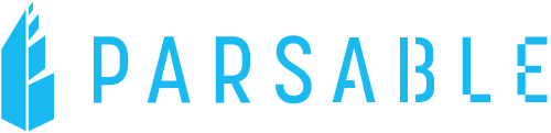
and So I designed this:
Of course, I put together a design brief (via Keynote) to explain my thinking. First, there was the usual competitive review, summarizing how other companies in the space were identifying themselves.

I always want my logos to tell stories. What is the story behind Parsable’s logo?
Click on the gallery above to see the Parsable story.
To seal the deal I demonstrated how well the logo would work in terms of swag and how it would support the company’s presumed phenomenal future growth.
Unfortunately it didn’t work out that way. Covid hit just before the start of the funding round. No one was going to meet in person so the material upgrades weren’t required. Parsable management also changed significantly, there are no plans to use the logo, and it was never copyrighted.
So I’m claiming the logo for myself. It’s a great representation of my design process.