Branding as UX: HAN:DLE
Handle developed an integrated email and task management portal with the goal of making people more efficient and, therefore, happier.
Handle’s first logo looked like this:

And my initial product wireframes/designs looked like this:

Handle was scheduled to be introduced at TechCrunch 2013 as part of the “Startup Battlefield” competition. We needed, at the very least, a logo that would look good on a t-shirt. I designed this:
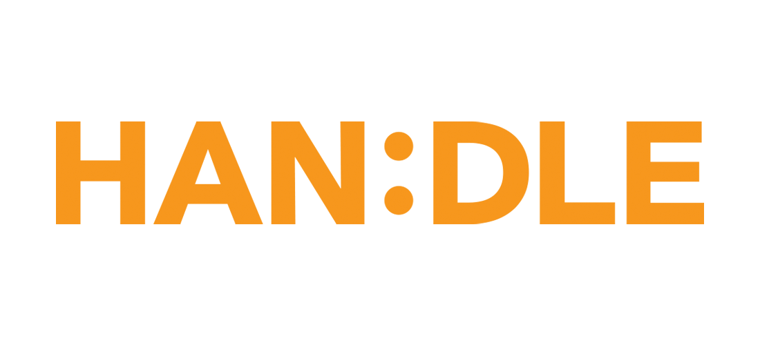
I like my logos to tell stories. HAN:DLE included an old school smiley which reflected the product promise. Better still, it was the first logo I ever designed that could also be reproduced in live type and content!
The logo direction also influenced my final product designs:

In retrospect, perhaps a bit on the garish side. But looked like nothing else out there.
We came in second in the Startup Battlefield competition, beating out Zendesk. But most importantly, we won the t-shirt war.
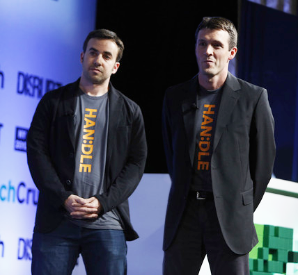
The HAN:DLE logo looked like a tie when one of our t-shirts was worn under a sport coat. Attendees loved it, asked for a shirt, and vowed to copy the idea with their own logos.