Palm Zire 71 case study
THE DESIGN PROBLEM
In 2003, Palm shipped the Palm Zire 71, its first multi-media centric handheld. I remembered my first briefing on the project. The product manager explained how the Zire 71 would have a high-resolution (320x320), 16-bit color screen, headphone jack, media player, and all the standard Palm apps. But wow-factor would be the built-in camera, a first for Palm, which was revealed when you slid the device open. Pretty slick.

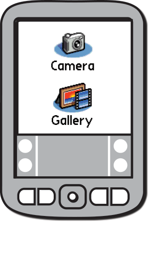
The lead software developer explained how we were going to use an existing photo Gallery app from the Palm IIIc. I would design—and development would create—a new Camera app.

Reuse this

Make this
How would the two different apps work together? The product manager explained it this way…
Turn on the Zire 71…

Open the Zire 71…

Open the Camera app…
And take pictures.
The user would turn on the Palm Zire 71.
The user would open the handheld.
The user would open the camera app.
And the user would take one or more pictures.
When the user was done taking pictures…

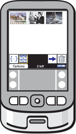
“Push” pictures to the Gallery app….

Delete pictures from the Camera app…

Go back to the Home screen…

And open the Gallery app.
The user would “push” the new pictures from the Camera app to the Gallery app.
The user would delete the pictures from the Camera app.
The user would open the Gallery app and manage their new pictures.
The manual picture management process worried me. But keeping two copies of the same picture, one in the Camera app and one in the Gallery app, would have been a poor use of limited storage space.
Is the camera broken?
I pointed out that the user could launch the Camera app without opening the handheld.

Turn on the Zire 71…

And open the Camera app. The lens would be covered and the screen would be black.
The lens would still be covered and the screen would be black. It would look like the camera was broken.
Did I lose my pictures?
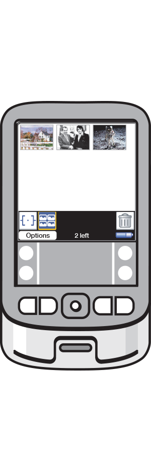
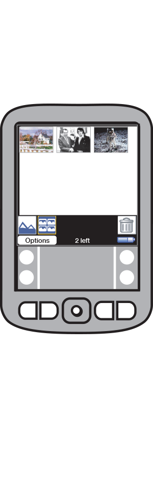
Conversely, the user could open the Gallery app without having first “pushed” the pictures from the Camera app.

And take pictures…

Go back to the Home screen…

And open the Gallery app. The new pictures would be “missing.”
The user might think they had lost the pictures.
The user could also launch any other Palm app while the handheld was open, either by tapping an app icon or pressing a dedicated hardware button. But no other Palm app could access the camera hardware and the device, when open, was a bit top heavy.
THE SOLUTION WHICH DIDN’T GET ACCEPTED
I suggested we develop a unified camera/gallery application to avoid all the back-and-forth picture management. But as is typical when developing products in the real world, there wasn’t time to create a combined app. I suggested that the new Camera app and the existing Gallery app share the same database to avoid duplication of pictures. That wasn’t possible because the goal was to use the Gallery app “as is.”
BACK TO THE DRAWING BOARD
I rarely use personas. I find product teams often don’t want to take the time to define personas in enough detail to avoid arguments about whether “Sue, the soccer mom,” drives a minivan or a compact SUV. I use “drivers” instead—what are the driving reasons a “user,” in a general sense, would want to use our product? In this case, the primary driver was simple:
As a user, I want to take and save pictures with my Palm Zire 71.
So what would the user have to do to actually take and save pictures with their Zire 71? I started doing some analysis. Making matrices. I focused on the form factor. The Zire 71 could be closed or open. The Camera app could be open or closed.
State matrix
Device: OFF, CLOSED;
A pretty common state when the device wasn’t in use.
Device: OFF, OPEN;
Possible but unlikely. Why would the user ever want this?
Device: ON, CLOSED;
Camera app: CLOSED;
This is the optimal way to use any Palm app other than the Camera app.
Device: ON, OPEN;
Camera app: CLOSED;
Unwieldy if all the user wanted to do was use any other Palm app than the Camera app.
Device: ON, CLOSED;
Camera app: OPEN;
Unusable state. The lens would be covered and the screen black.
Device: ON, OPEN;
Camera app: OPEN;
The only state that allows a user to take pictures.
After removing useless or unhelpful states from consideration, I noticed some interesting relationships between remaining states:
Opening the device could be interpreted to mean the user wanted to take pictures.
Closing the device could be interpreted to mean the user was finished taking pictures.
THE SOLUTION THAT DID GET ACCEPTED
These insights inspired the final interaction design:

The handheld is closed and can be either on or off. The Camera app does not appear on the Home screen.

The user opens the handheld. The Camera app opens.
The user takes pictures.
The user closes the handheld. All picture management happens in the background. The Gallery launches automatically.
Opening the handheld would launch the camera app whether the device was off or on. Except for the shutter button, all hardware buttons would be disabled. The Camera app icon would not appear on the Home screen,
The user would take pictures.
Closing the device meant the user was done taking pictures. The Camera app would automatically push new pictures to the Gallery app and then delete the pictures from its own database. Next, the Gallery app would sub-launch and display the pictures. The Camera and Gallery interfaces would match pixel-to-pixel, and the user would never know one app had quit, another had been launched, and pictures had been managed automatically.
CONCLUSION
This interaction design met all the original product requirements but broke several “inviolate” Palm OS design principles:
Every hardware button remains active.
Every app must be shown on Home screen.
The user can switch between apps at any time.
Breaking these rules, even if it meant creating a better overall product experience, was a cultural challenge for the team. The team imagined millions of existing Palm users upgrading to the Zire 71 and being furious about not being able to do…what? That’s what I had to convince the team of—there was nothing about those three “inviolate” design principles we had to support when the Zire 71 was open.
I submitted this project as a use case to present at the SIGCHI conference in Vienna the following year. It was interesting to read reviewer’s comments on my abstract. One reviewer, a professor of user experience, wrote that this example had nothing of value for his students or other UX designers because it didn’t follow the UX development process as he taught it—design patterns had been intentionally violated, users were given false information about the state of the system, etc. Other reviewers, mostly from the tech industry, said that that was precisely WHY this example was useful—it documented what actually happened when designing products in a real world business setting.