
Senior Director of Kindle User Experience
7/2010 - 7/2012
I was responsible for the UX design of three generations of Amazon Kindle eReaders.
Responsible for overall systems design (e.g. on-device account creation▸), on-device look-and-feel, user testing, user documentation, and project management for the first compact Kindle, first touch Kindle, and the Kindle Paperwhite (the first high-res and backlit Kindle).
Presented regularly to Amazon C-suite, including Jeff Bezos
Design highlights include two software keyboard designs▸ (5-way rocker and touch interactions), out-of-box experience▸ (OOBE), library management, on-device purchases, integrated advertising, and a complete look-and-feel refresh.
Promoted standard UX design processes, specifications, systems, user testing methodologies, and deliverables across Lab126 and Amazon.
Identified, hired, mentored, trained, and managed employees, contractors and agencies.
Kindle Paperwhite
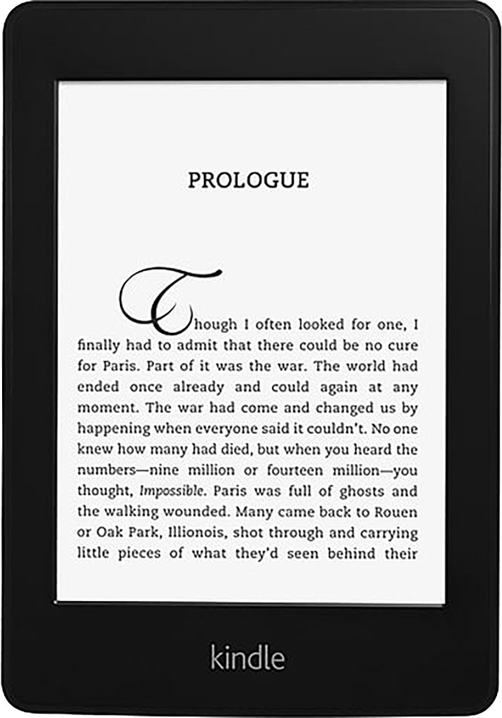
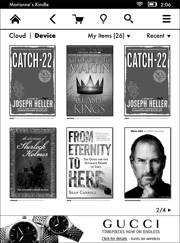
The Kindle Paperwhite introduced a back-lit screen and higher-resolution display. I proposed a thorough UI and UX revamp of Kindle software to support these features and address competition from other tablet devices.
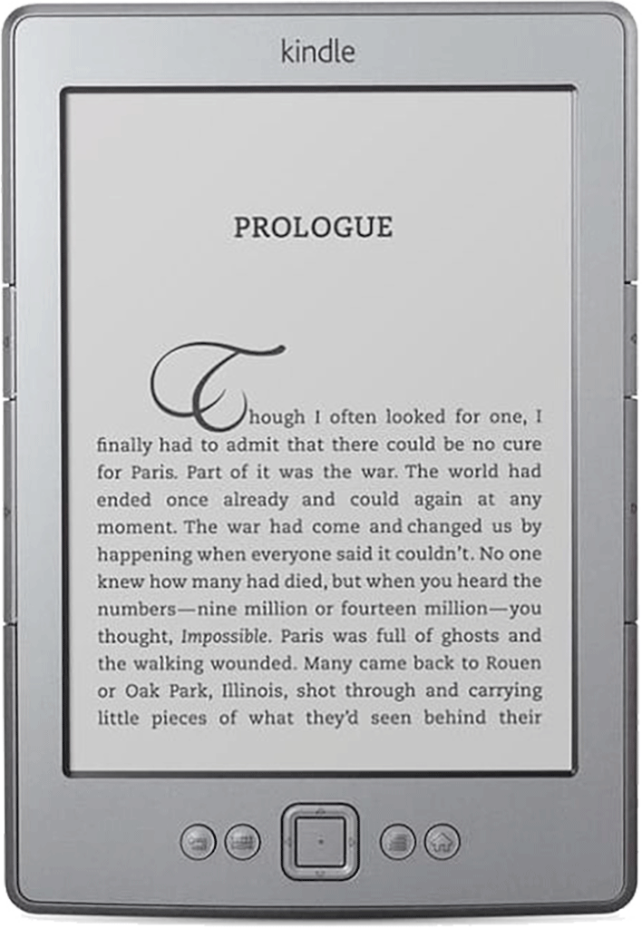
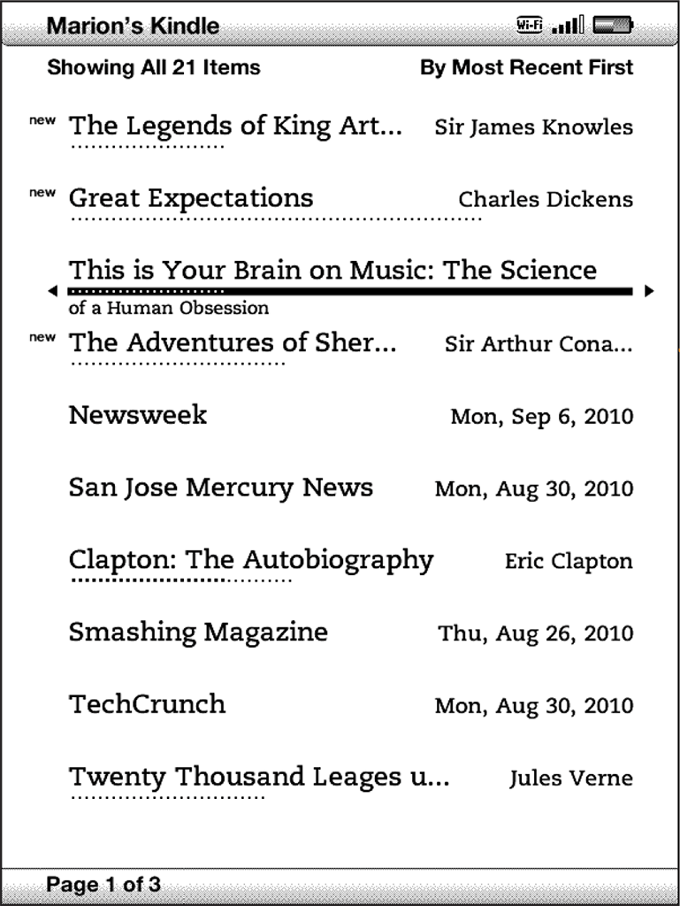
I tweaked the old Kindle Touch layout (see below) as part of the UI effort. Book covers were made larger and now included progress indicators. I removed the ever-present Search field to make room for important new features. And swapping Futura for Helvetica added personality.
I also proposed adding more typefaces to allow users to customize their reading experience and worked directly with Monotype to select and tune fonts for e-Ink displays.
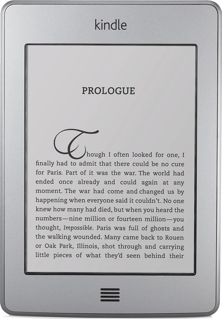
Kindle Touch
The Kindle Touch was a massive UI and UX effort. My team and I had to design a touch interface which had minimal development impact on existing code and features.
The biggest design challenge was developing the touch gesture library. I conducted an exhaustive survey of existing touch products to identify standardized gestures. This was the starting point for mapping gestures to specific Kindle features. The big question was how gestures mapped to overall system navigation. For example, did up or down swipes while reading take the user to different chapters or out of the book and to, say, the Home page?
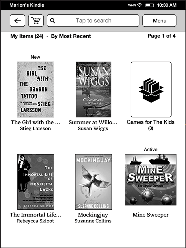
Third-generation Kindle
As originally planned, the design for the third-generation Kindle would have had no hardware keyboard and only two function buttons. This would have reduced production costs but result in a terrible navigation experience. I conducted a massive interaction survey to show that the user would need to execute over three times as many taps to complete basic tasks with only two function buttons. The ID team was annoyed, but added two more buttons.
This example compares two- and four-button UX for navigating through the Kindle Store. With a dedicated Back button, returning to the storefront required two button presses. Without a dedicated Back button, it required six button presses.
My team and I had to map the existing Kindle UX (which relied on a built-in hardware keyboard) to the new form factor and design a new, on-screen keyboard. The on-screen keyboard wasn’t difficult in itself. But we had to integrate it into existing screen layouts without requiring screen redraws. This meant the keyboard, when activated, couldn’t appear in a fixed location. It had to hop around and appear directly above or below the text field the user wanted to edit. It was a tough problem but the final design tested really well.
Kindle screensavers
I made the case to replace all Kindle eReader and Fire table screen savers. I pointed out that we were about to release Kindles internationally and the current eReader screen savers showcased English-speaking authors. As a side concern, some Kindle users thought the author portraits weren’t aesthetically pleasing and entire discussion threads were dedicated to getting Amazon to “ditch the creepy, dead author screensavers.” And the Kindle Fire needed media images other than print.
I acted as creative director on the project. The resulting images won Communication Arts magazine's 2012 award for excellence in commercial photography. This was a particularly satisfying project because, in the end, it just made users happy.